For those of you who might be confused as to why we’re remodeling when we’re supposed to be building here’s the dealio: we bought our rental house. Our lease was set to expire in March and our landlord said it was no problem to renew for another 6 – 9 months. Two weeks later he texts us and says he’s selling the house. Great. We scoured local listings, but rentals are hard to come by on the island. Plus, they’re crazy expensive – usually $1700 and up. We found this house after hitting refresh on craigslist every half hour for three months straight. Not kidding.
We didn’t want to move into an apartment and we dreaded the thought of having to show the house all the time, so on a crazy whim we put in an offer. We haven’t decided yet if we’ll sell it right away or keep it as a rental like we did with the Beaufort house.
I know I gave somewhat of a tour when we first moved in, but here it is slightly cleaner and without boxes and pantyliners all over the place:

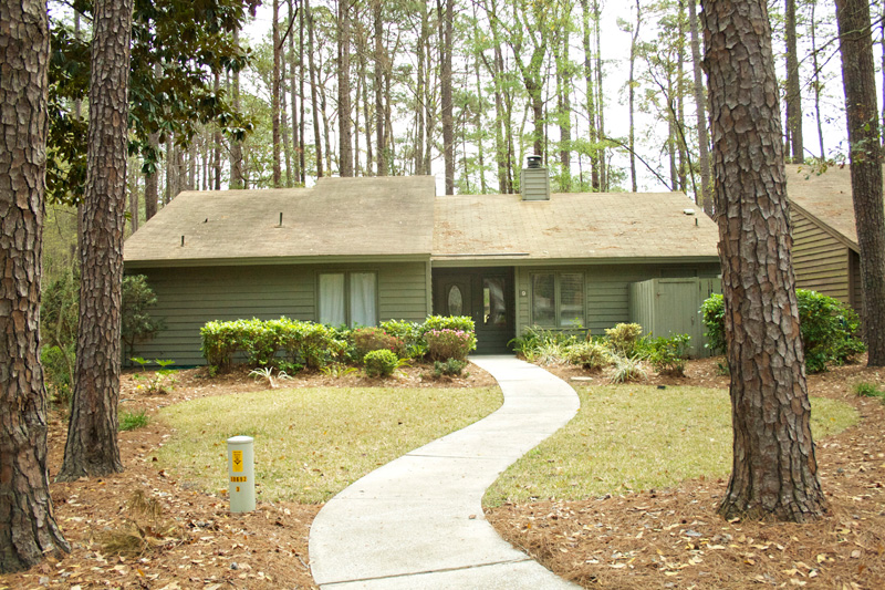
It’s your typical older home on the island. It was built in the late 70’s. With the exception of those bushes, the property is beautiful. The house, on the other hand, needs a serious makeover.

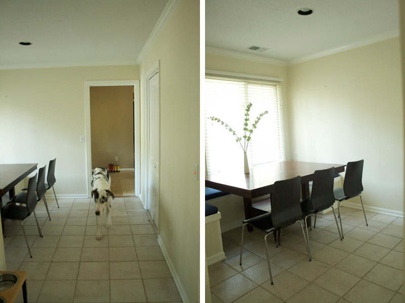
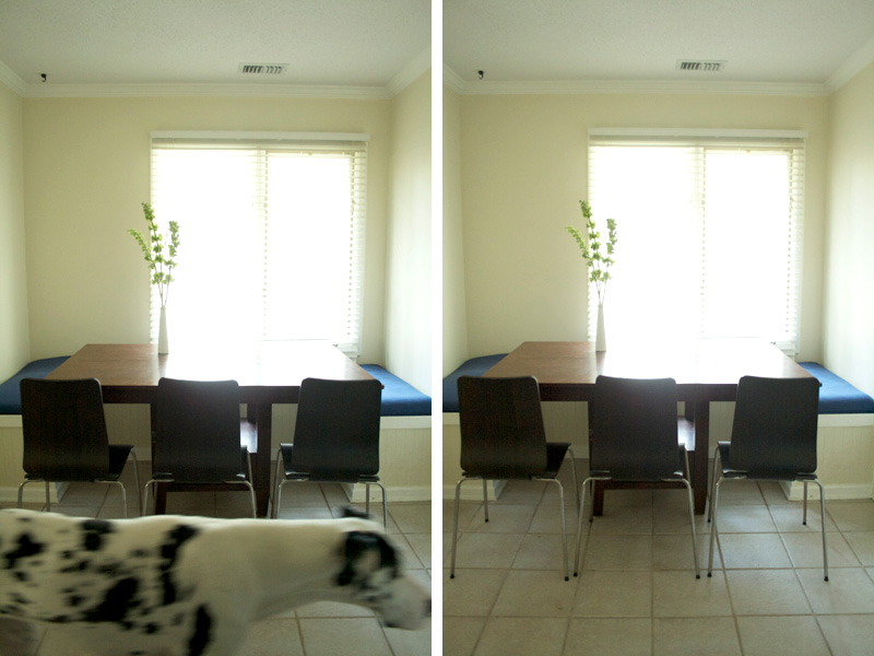
This is the dining room. Technically it’s more of a breakfast nook area, but we don’t use the dining room as a dining room. Kenzie is the worst photo bomber.

Here’s another view of the dining room. I can’t figure out why they didn’t install a third window. It’s always annoyed me. It looks off centered from the inside and the outside. The dining table was left by the landlord. It’s ugly, but fits perfectly in the space. We’ll give it a little makeover, too.

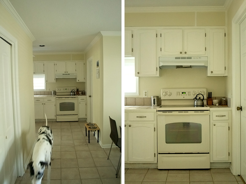
This is the view from the entry to the dining room and on to the kitchen. That door on the left is a walk in pantry. The door beside the stove leads in to the laundry room.

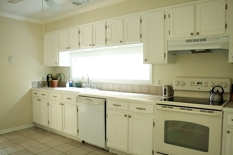
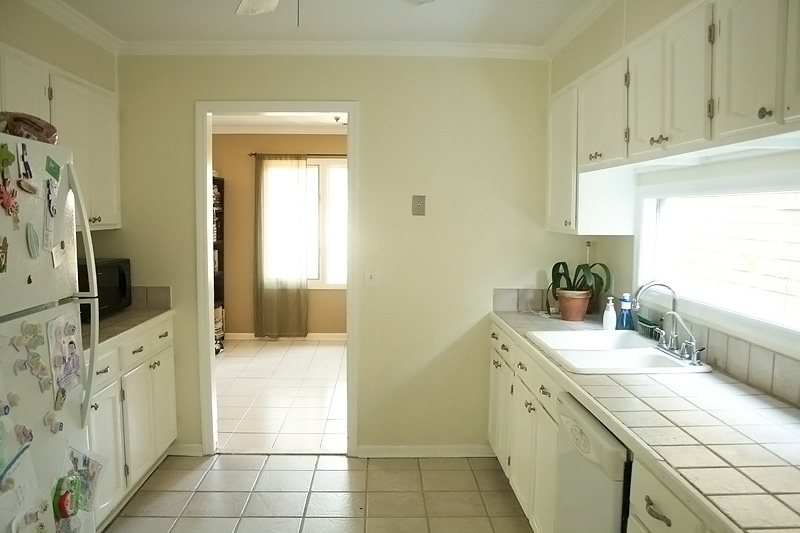
The appliances will all have to go. The racks in the dishwasher are broken and rusted. I consider getting a tetanus booster every time I wash dishes.

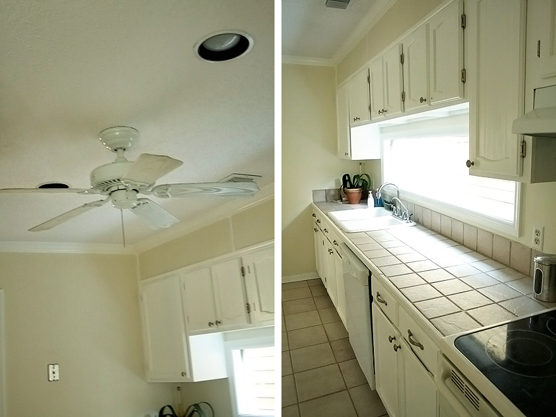
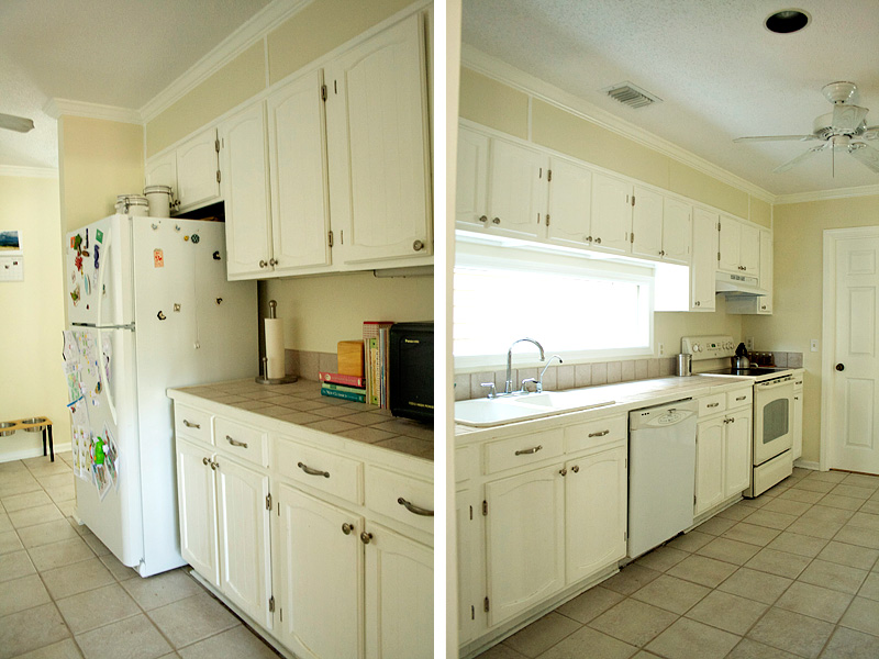
WHY is there a fan in the kitchen? Seriously? That’s so gross. Fans get dusty and even if you use a swiffer you’re still going to have bits of dust flying about. And the countertops? I can’t even talk about them without seeing red.

The kitchen is kind of a wide galley style. It’s spacious, but useless. There’s no room for anything. Is that an oxymoron? Spacious with no room?

Here’s a view from the other direction.

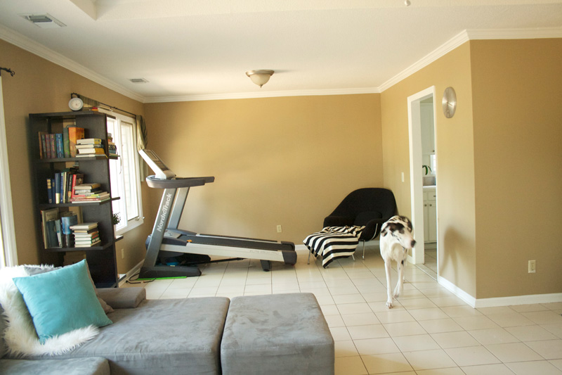
The kitchen exits into what should be the dining room. As you can see my beast of a treadmill takes up all that space. I have no idea what to replace that boobie light with so if you have any suggestions feel free to share.

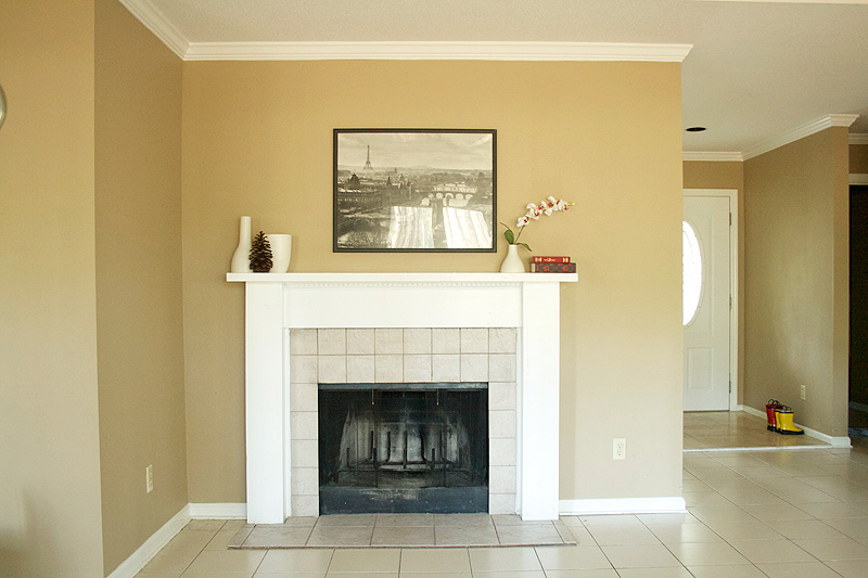
The fireplace is terrible. Rather than removing the existing tile, the owner added another piece of backer board to the floor and tiled on top. It’s warped and cracked and ugly. And the tiles on the surround were just glued on. They’re loose and wiggle. (Also, I know the picture is off center, but didn’t want to put any nails in the walls so I just used the one that was there.)

Here. Enjoy this cuteness while your eyeballs rest from all the ugly this house tour is throwing at you.

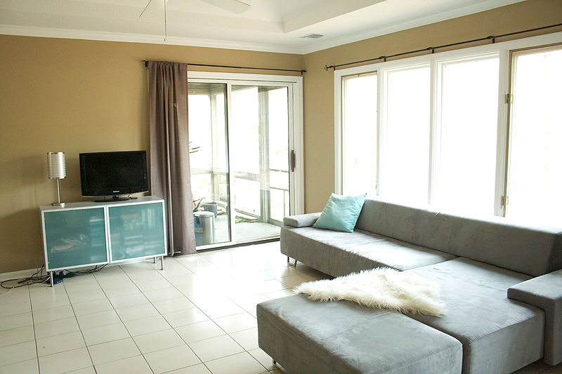
Living room complete with a tiny TV. I can’t justify getting a new one, because we don’t really use this one.

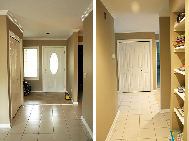
On the left is a view from the living room to the entry. That door is an eyesore. On the right is the hall towards the entry/closet. That shelf is a junk/catchall area.

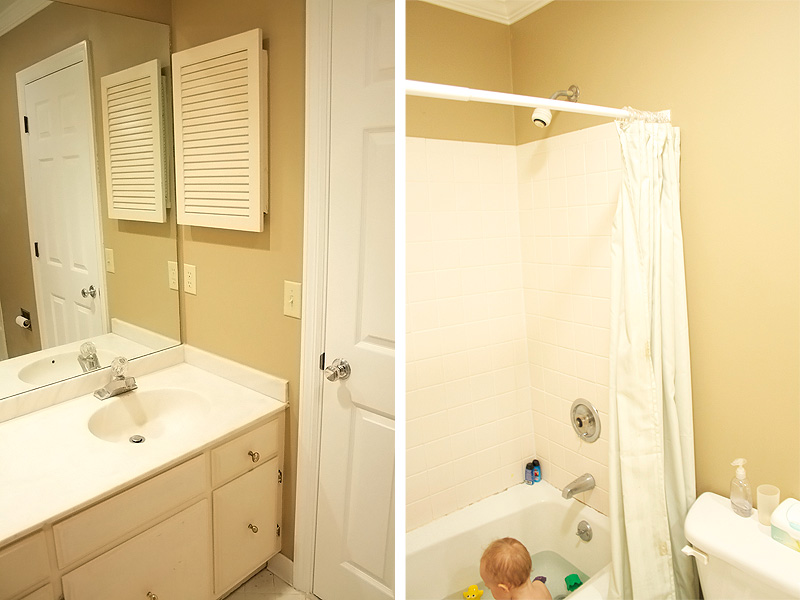
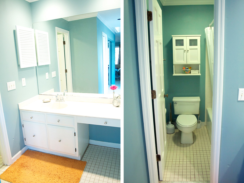
This is the boys’ bathroom. So much to do. The medicine cabinet is awful and rusty and that caulking will NOT come clean, so we’ll need to cut that out. We’ve got lots to do ya’ll.


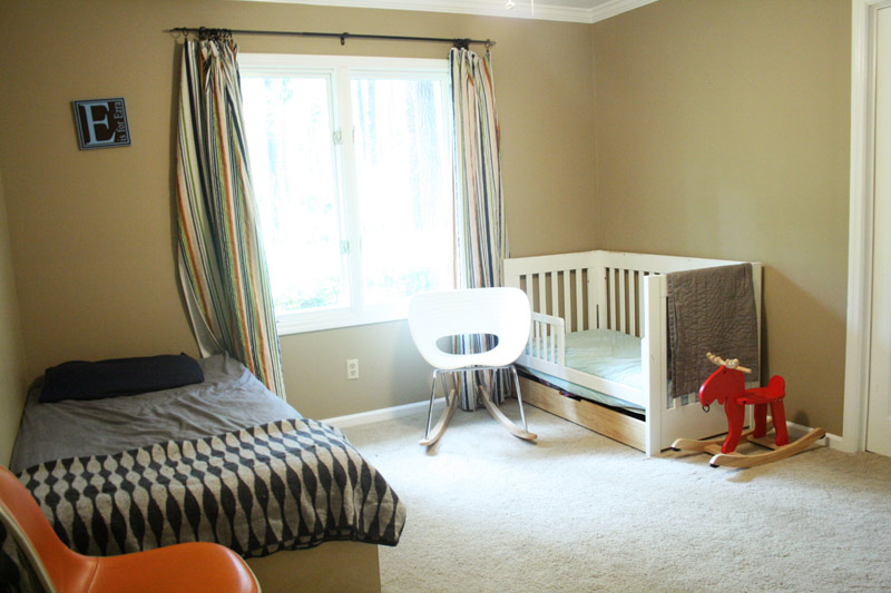
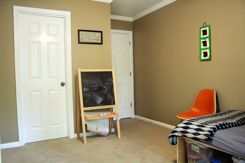
This is the boys’ room.

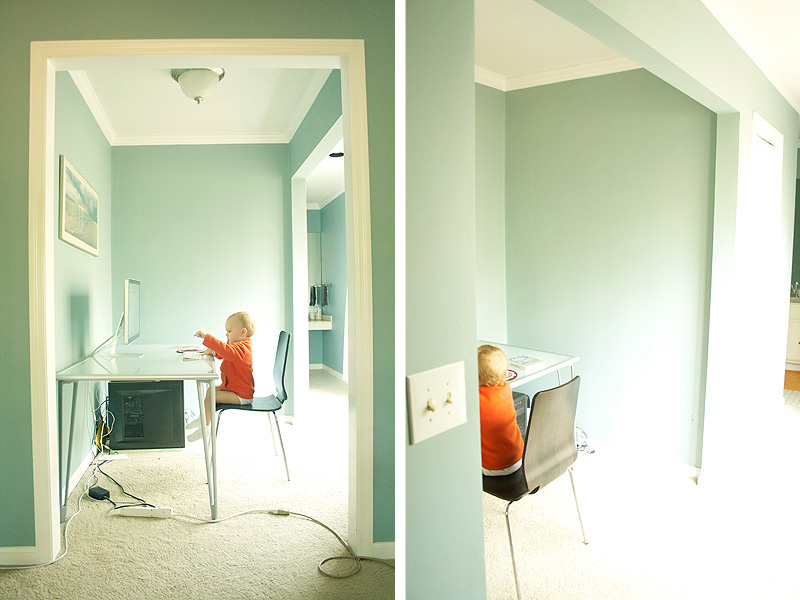
This is the office nook. I’m not really sure what it’s intended purpose is, but that’s what we use it for. These pictures are being far too kind to this wall color. It’s really ugly in person.

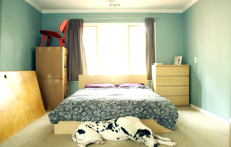
I call this stack in the corner the leaning tower of Eames. We’ve had the red LCW out in the living room forever, but the other two have lived in their boxes the past 5 years. Those doors are for the beach house and they are incredibly heavy. Brad and I can hardly lift them together which is why I didn’t bother to move them out of the picture. I think Kenzie makes the shot. She makes any room look better. 🙂

This is the master bath and the end of the tour. Thank you for coming. Enjoy the rest of your stay.
UPDATE: We finished the remodel ages ago, but unfortunately we lost the after photos we took. I happened to stumble across the old MLS listing for the house and took screen shots. You can see the after photos here. If I ever find the after photos I took myself, I’ll be sure to update the post.
